The <dfn> tag

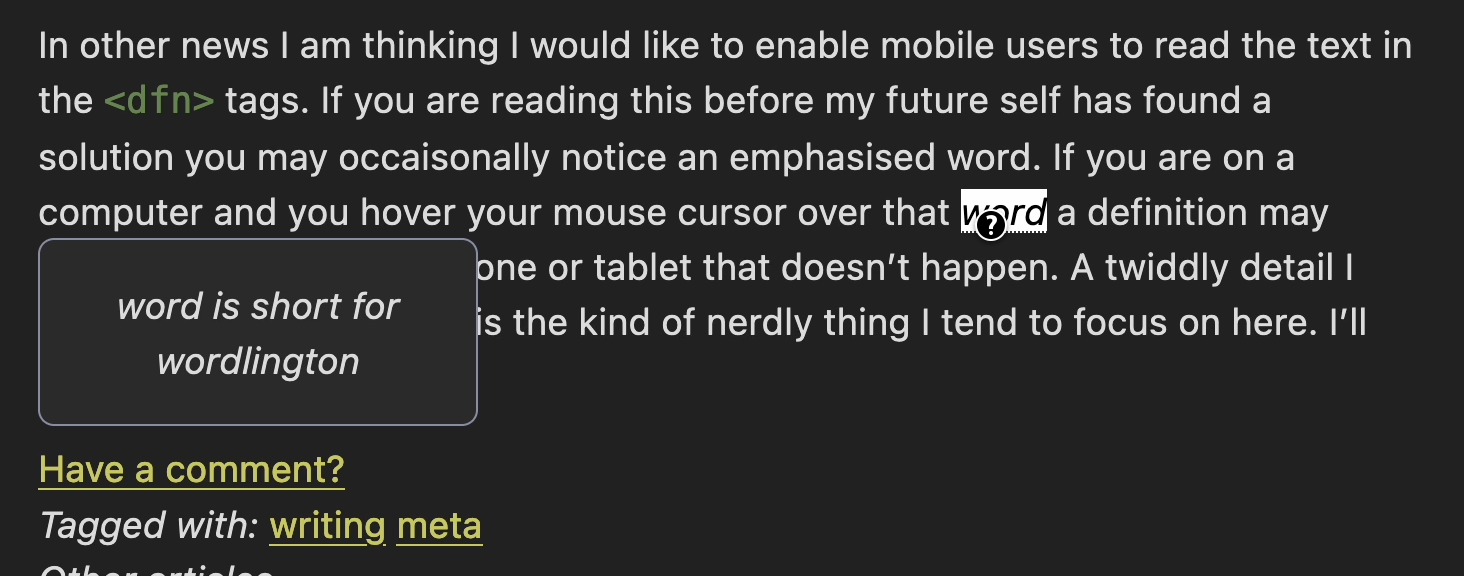
In a previous post (pictured above) I wrote how I would like to enable mobile users to read the ‘title’ text in the <dfn> tags and also with the <abbr> tag.
Anyhoo… This is what I did.
First I edited my CSS to allow the <dfn> tag itself to highlight the word so the user knows they can poke it:
  dfn

  {

    cursor: help;

    text-decoration: underline dotted;

    position: inherit;

    border: none;

  }
Then I retrieved the <dfn>‘s title attribute and used the ::after pseudo element
to style it.
  dfn::after

  {

    display: none;

    padding: 1em;

    border-radius: 2px;

    opacity: 0;

    color: var(--text); !important;

    border: 1px solid var(--border);

      border-radius: 8px;

    background: var(--accent-bg);

    text-align: center;

    content: attr(title);

  }
Then I styled some different aspects of the hover event so the user knows they’ve done something.
This code highlights the word being defined:
   dfn:hover

   {

    color: black !important;

    background: white;

  }
Then I changed the pseudo-element from display: none; to display: block; the definition is displayed according to the styles here:
  dfn:hover::after

  {

    opacity: 1;

    display: block;

    position: absolute;

    float: left;

    max-width:220px;

    width: 50vw;

  }
I am not happy with placement, it hangs off to the left. I played around with the position property with limited success. Ideally I would make it pop up above the word it is defining and not to the left beneath the users hand.
Some time down the track I think a better understanding of the CSS positioning and the pseudo-elements may help me work out the positioning problem. Unless you have any better ideas?
I’ve added an email comment link to my posts, go ahead and tell me where I can improve this.
Comments
Add a comment?There are no comments yet.
